15-Nov-2019 by Sherlock Homes
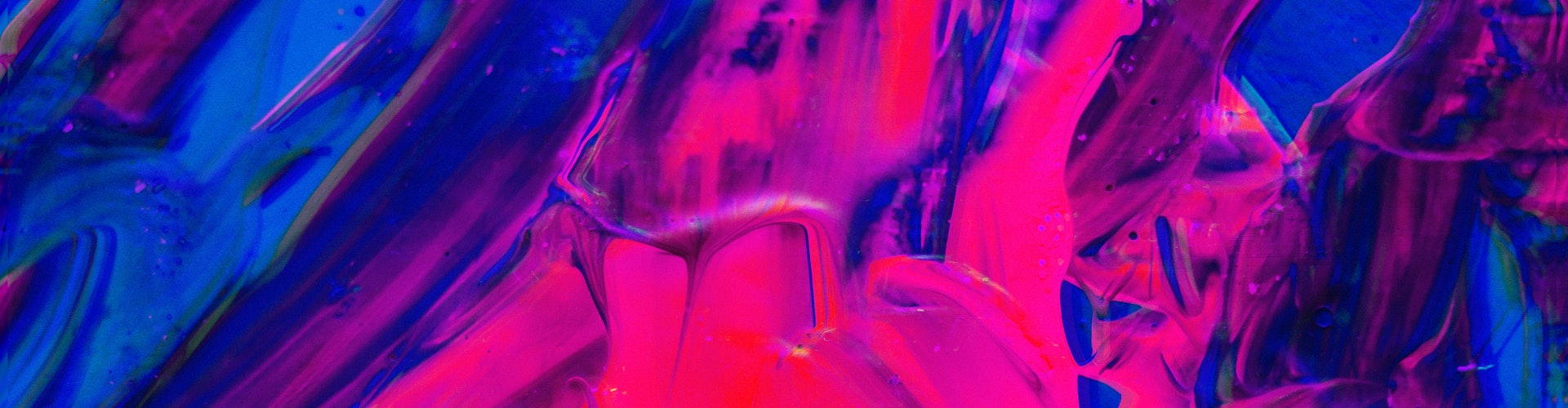
Pt chooses Classic Blue for its colour of the year 2020
Black Lines brand identity, by & Smith
Black Lines wants it to be as easy to serve a Negroni as it is a pint of lager. The drinks company is seeking to revolutionise the bar experience by serving cocktails by draught with a changing menu of drinks (as well as same favourite stand-bys). A pink grapefruit spritz was served through the summer while a new pear and white tea fizz joins the line-up for winter.
- ROFL means Rolling on floor laughing.
- STFU means Shut the freak up.
- LMK means Let me know.
- ILY means I love you.
- YOLO means You only live once.
- SMH means Shaking my head.
The company was previously known as Hingston + Co. but has been given a complete rebrand — including a new logo, tap badges, website and branded material — by London-based design studio & Smith. The new identity is based on the Kandinsky abstract painting, Black Lines, and true to its name, is mostly black and white with a few flashes of colour. According to & Smith, the identity brings together “art and science” and has been brought to life through collaborations with nine illustrators.
- ROFL means Rolling on floor laughing.
- STFU means Shut the freak up.
- LMK means Let me know.
- ILY means I love you.
- YOLO means You only live once.
- SMH means Shaking my head.
Black Lines wants it to be as easy to serve a Negroni as it is a pint of lager. The drinks company is seeking to revolutionise the bar experience by serving cocktails by draught with a changing menu of drinks (as well as same favourite stand-bys). A pink grapefruit spritz was served through the summer while a new pear and white tea fizz joins the line-up for winter.
"The public is more familiar with bad design than good design. It is, in effect, conditioned to prefer bad design, because that is what it lives with. The new becomes threatening, the old reassuring." Paul Rand, graphic designer
